Changing the Perspective on the City of Albuquerque, New Mexico
The first thing that likely comes to mind when you think of Albuquerque was Netflix’s favorite chemistry teacher turned drug manufacturer. That is, Breaking Bad of course. The series hit our screens back in 2008 and ran for five seasons up until September 2013. The show was based in Albuquerque and put the city on the map. Thanks to the series, they ended up with an influx of tourists.
Nevertheless the mayor of the town wanted it to be known for just more than TV shows and, of course hot air balloons; the annual international balloon fiesta brings in over 750,000 visitors over the 9 day period and, although it makes the city very insta-worthy, the town’s vision was to expand to be more than just the place where you go see the balloons.
Albuquerque Clearly Defining Their Branding Goals
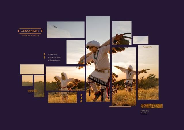
https://www.abqjournal.com/630432/albuquerque-the-brand-gets-a-makeover.html
We know that successful city rebrands come with clear objectives and a vision in mind of what you want for the city.
The city’s main objective was to brand themselves as a place that promotes being open, inviting and most of all, unpretentious. The idea was to convince the rest of America as well as the world that there’s more to Albuquerque than meets the eye – in this case, a TV show.
Albuquerque Created a New Tagline Slogan
Prior to 2015, the city’s tagline was “it’s a trip”, and it was created as part of their branding strategy that was undertaken 15 years prior, and unbeknown to them, ended up tying in with the whole Walter White thing when the series aired a few years later.
Knowing this was something they wanted to step away from, the city officials came up with the new tagline “change your perspective”. Residents of the town were pretty happy with this new tagline, though there were some concerns that tourists may have assumed that the prior perspective was bad and had to be changed, thus putting off visitors. Nevertheless, the campaign appeared to be successful and Albuquerque is gradually becoming a tourist spot for more diverse things – not just Breaking Bad fanatics.
When the tag line for the city changed, so did the website. They purchased a new domain, visitalbuquerque.com and changed the name of their tourism board as a whole to Visit Albuquerque.
Formerly known as the Albuquerque Convention and Visitor’s Bureau (which was frankly a lot to take in), the new name is short, sweet and to the point – “Visit Albuquerque.” Though not completely unique (many cities adopt such names), this is a prime example of how simplicity in a city’s branding can be the most effective tool.
Albuquerque’s New Logo Design
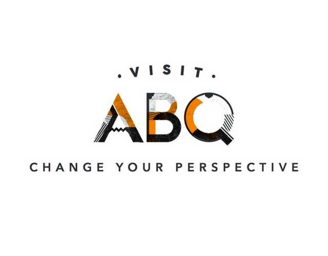
With the new website and tagline came a newer and more modern logo which represented a city with strong native American roots and beautiful artwork.
The logo was launched at the end of 2016, with the help of the company RK Venture. They ditched the old fashioned squiggly ‘Q’ with something a little more modern that still incorporated Albuquerque’s rich history.
Through this logo design, the city of Albuquerque wanted to incorporate several aspects of the city’s culture into this logo but still keep it both legible and fluid so that it could be easily adapted if necessary. They managed to achieve this by having all the letters made up of individual sections that all integrated well together through the artwork. This also represented how the various parts of Albuquerque come together to make one city, full of diverse culture and talent.

Becoming an Entrepreneurial Hub
The rebrand of Albuquerque has been several years in the making, and in 2017 they wanted to target a new kind of visitor to the city; entrepreneurs. Albuquerque isn’t really the first town that springs to mind when you think about entrepreneurial cities but it’s definitely beginning to put itself on the map, with many venture capitalists investing in new Albuquerque based businesses.
They launched a marketing campaign nationally that featured videos on their innovation website ABQic from local entrepreneurs and focused strongly on social media, using both paid and organic advertisements.
They also got their name out there by sponsoring several entrepreneurial conferences around the country, having a huge 26-page spread in Southwest’s inflight magazine and spread the word with multiple press releases when the city was voted top spot for pay, education, and gender-equality.
Millennials in particular were likely the target of this campaign; they’re at a prime point in their lives to be entrepreneurial, are heavily influenced by what they see on social media, and would be the most likely users of the city’s 13,000 sq. ft FUSE Makerspace, which was built within the city’s community college and houses the latest in high tech machinery and computer programs.
Their impressions for this campaign were reported by Forbes to have hit a whopping 44 million people. The results? They’re now giving Silicon Valley a run for their money having become one of the newest and hottest places for technology startups.
Is Albuquerque considered a successful city rebrand?
Though rebranding a city can face its challenges, as you can see, with clear goals and a vision of what you want your city’s rebrand to look like, you can create a successful brand that encompasses everything that your city is about or, want it to be in the future. Albuquerque is definitely one of the success stories of a city that managed to change outsider’s perceptions of what it has to offer.
By initiating the rebrand in phases, creating small milestones and focusing on one small part of their municipality branding each year, they have created something successful and sustainable.
Contact VisualFizz to learn more about branding for cities, government bodies, and municipalities.
Publishing Date:


