The Problem
After a website redesign that failed to deliver expected results, CCHC reached out to VisualFizz for assistance with WordPress Website Optimization with a goal to achieve a faster, more user-friendly, and updated experience for those seeking care.
The Solution
After a website redesign that failed to deliver expected results, CCHC reached out to VisualFizz for assistance with WordPress Website Optimization with a goal to achieve a faster, more user-friendly, and updated experience for those seeking care.
The Result
- Improved User Experience
- Increased Website Speeds
- Easier Appointment Setting
- Improved Visibility for Current Medical Needs, Including COVID19 Testing
A Deeper Look into the WordPress Development Needs
When CCHC connected with VisualFizz, the brand was facing serious challenges with website performance and subsequent user engagement. After investing a five-figure budget into a complete WordPress site redesign, the results were underwhelming.
Persistent issues with slow-loading pages and a less-than-desirable WordPress theme made it difficult for users to access and locate the information that they needed, and further search efforts were hampered by a lack of search bar functionality.
Since the brand website was crafted by a team of developers rather than a full-service digital marketing agency like VisualFizz, the resulting website focused on the development of design elements and software engineering but lacked a perspective towards ease of use and the promotion of user engagement.
When VisualFizz entered into a partnership with CCHC, we thought beyond the programmatic aspects of the website update, and instead thought about how the website fits into the other parts of the strategy as a whole.
As a donation-driven non-profit organization, CCHC aimed to improve customer service-related issues, like long website load times and busy phone queues, as well as make crucial healthcare information more accessible (in both English and Spanish) to better serve their communities.
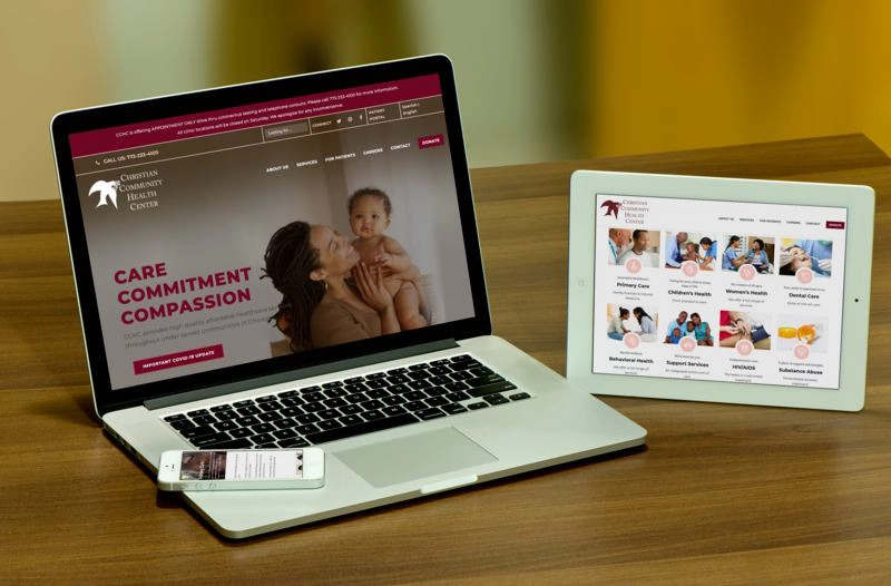
Multilingual WordPress Landing Page Re-Design
VisualFizz experienced several unique challenges throughout the duration of this project. Operating on a tight budget due to the previous website investments, and as a Non-Profit Organization, CCHC needed VisualFizz to streamline development periods and prioritize tasks to make significant and immediate impacts on the CCHC website.
First, the VisualFizz development team removed the loading screen module from the previous web design, as well as any outdated plugins and unutilized or improperly implemented javascript. These changes immediately improved the load times on the CCHC site. From there, VisualFizz designed and launched a cleaner WordPress theme that took similar information and grouped it into more visually appealing elements. Additionally, an FAQ section, an insurance provider table, a more developed Spanish language section, and social media tags were also added to better build out the existing information and improve accessibility.
The Results of the VisualFizz Partnership
CCHC patients experienced a faster-running website immediately, thanks to the initial live site changes. Upon relaunch of the redesigned landing page layout, patients can now access a variety of information in a clean, simple way.
Reorganizing the information in a grid structure, improving the website navigation, and improving the search functionality of the website were all high priority.
A white background was added with the maroon color added as an accent color. This design change was aimed at improving the readability and accessibility of the information on the page. Finally, social media buttons on the header and additional information sections aimed to reduce telephone inquiries and improve overall customer satisfaction in both English and Spanish-speaking CCHC patients.

